Architecture & Construction · 2025
Transforming Fragmented Enterprise Workflows into a seamless ecosystem with a Unified Design System
Designed and implemented a scalable enterprise-grade design system for a construction and infrastructure organisation to unify UX across multiple internal platforms. The solution streamlined design and development workflows, reduced UI inconsistencies, and enabled faster product delivery through reusable components and standardised interaction patterns.
Project Overview
The Challenge
Understanding the problem
The organisation had grown through acquisition, leaving behind a patchwork of interfaces each built with different tools, conventions, and design philosophies. Product teams were duplicating effort, users were context-switching constantly, and there was no agreed source of truth. A design audit across all platforms revealed over 200 unique button variants. A symptom, not the disease.
Research & Discovery
What we uncovered
Key Findings
Strategy & Approach
Design principles
Process
How we got there
Solution
What we built
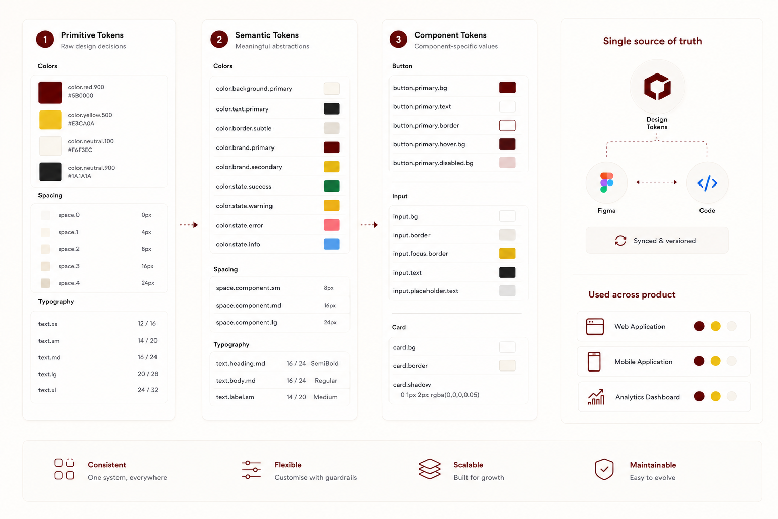
Design Token Architecture
A three-tier token system (primitive, semantic, and component) gave teams a shared vocabulary while allowing product-level customisation without fracturing the system. Tokens were the single source of truth, synced between Figma and code.
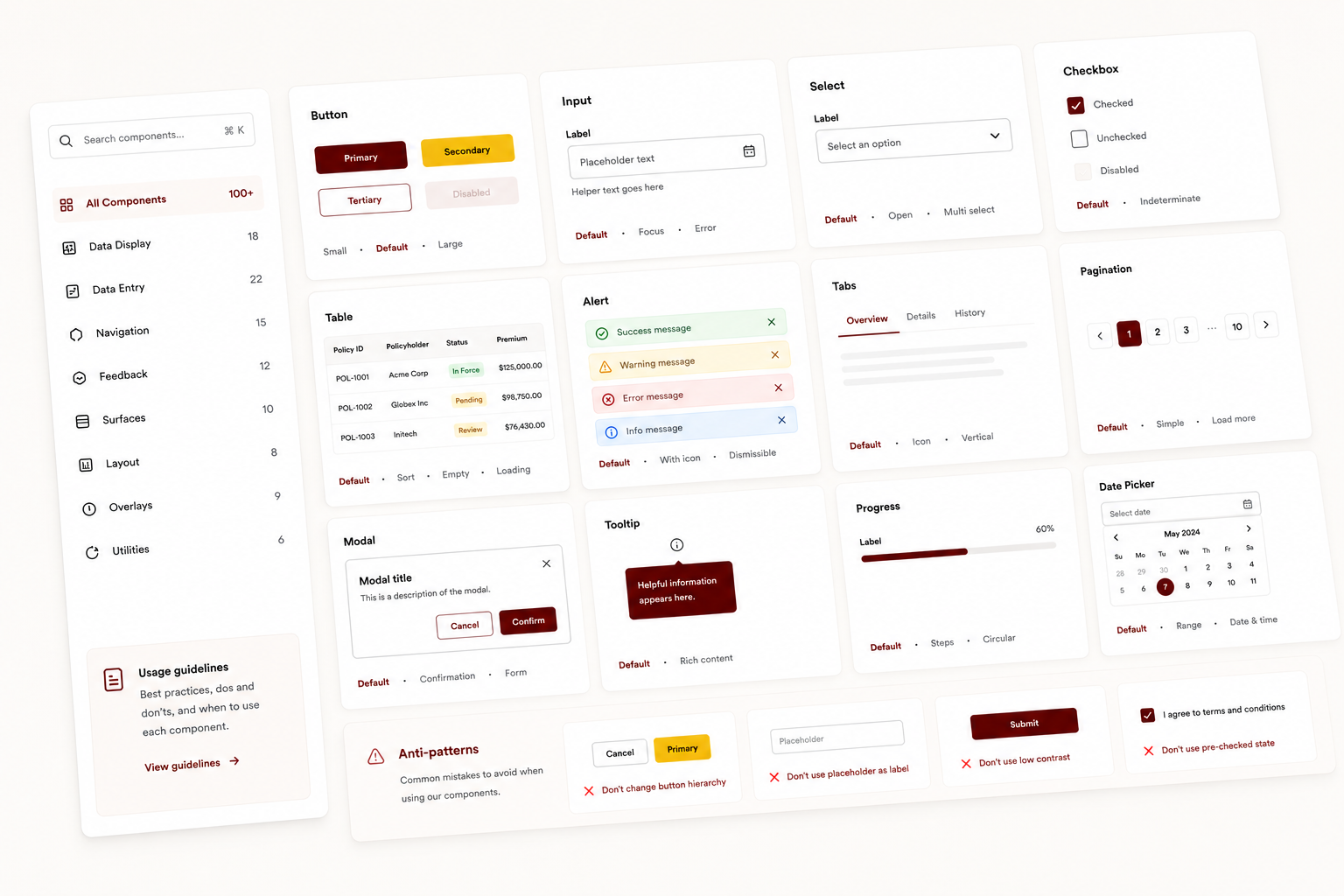
Component Library
Over 100 production-ready components built collaboratively with engineering, each accessibility-audited and paired with documented usage guidelines, interaction specs, and documented anti-patterns.
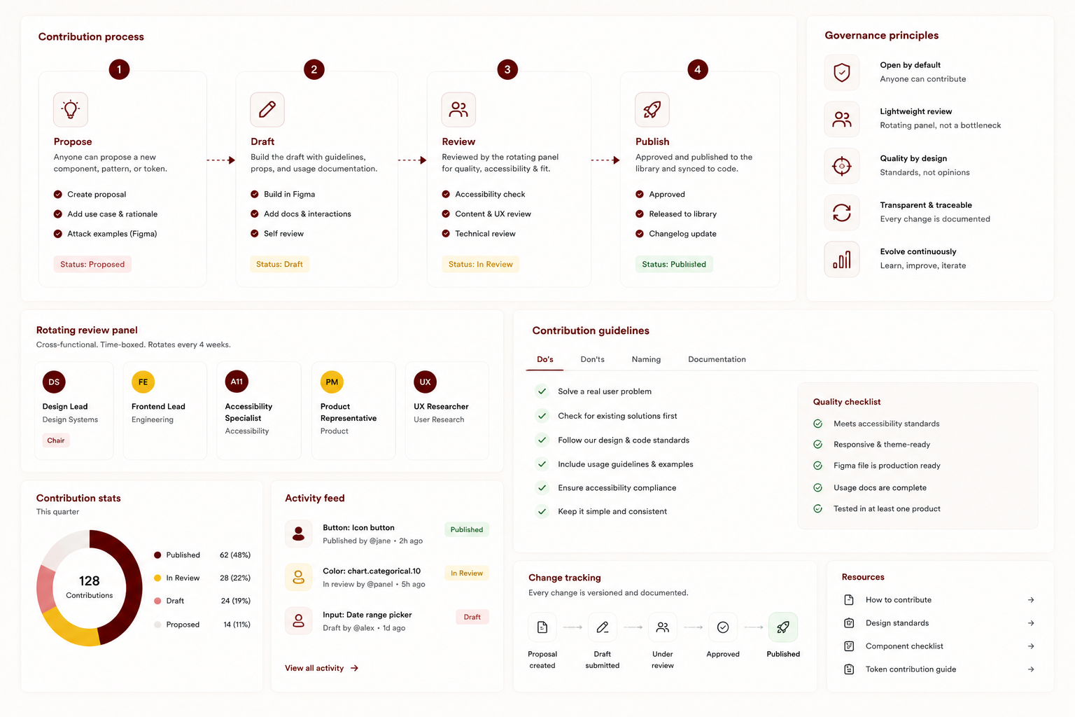
Governance & Contribution Model
A structured four-stage contribution process (propose, draft, review, publish) let any team add to the system while maintaining quality. Governance was lightweight by design: a rotating review panel, not a centralised gatekeeper.
My Role
Contributions & ownership
- Stakeholder interviews
- Heuristic audits
- Workshop facilitation
- Adoption research
- Token architecture
- Component library
- Documentation system
- Figma structure
- Governance model
- Contribution process
- Adoption roadmap
- Success metrics
- Engineering pairing
- Champion network
- Office hours
- Team enablement
Outcomes & Impact
Results that speak
Reflection
What I learned
The hardest part wasn't the design. It was adoption. A system nobody uses is just a side project with good documentation. Investing as much in the community and governance model as in the components was what made it stick. I'd do one thing differently: involve engineering earlier in the token architecture decisions, before the first component is drawn.